
Shopify Product Image Zoom: A Practical Setup Guide
Set up product image zoom without rebuilding your Shopify product template.
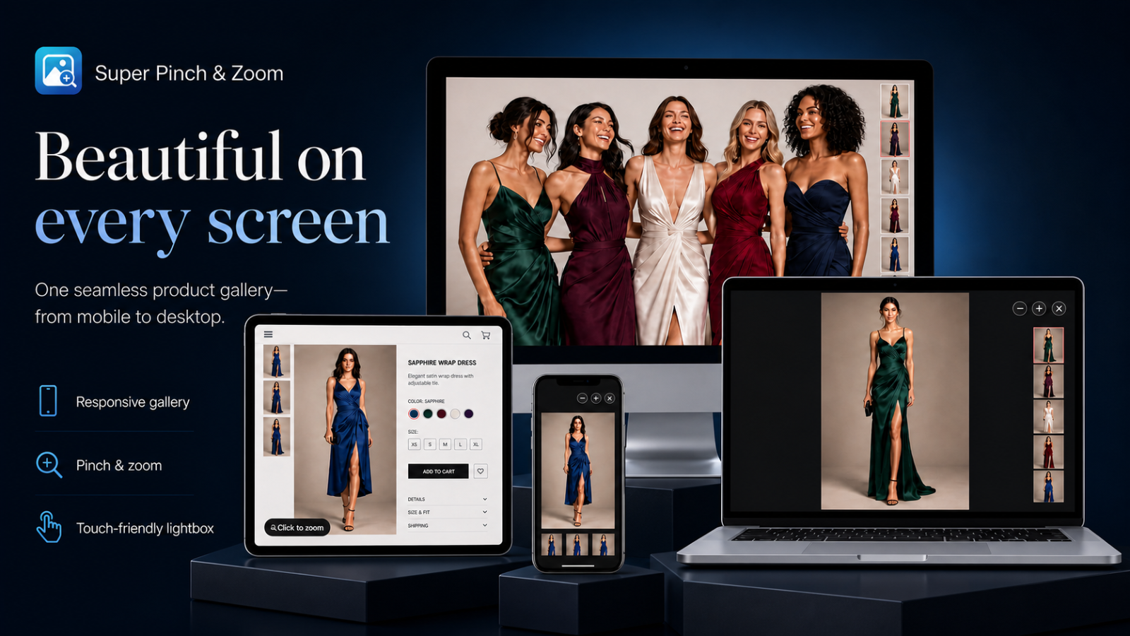
Product image zoom helps shoppers inspect texture, finish, stitching and other details that are difficult to judge in a standard gallery. The best setup supports that decision without hiding product information or competing with the theme.
1. Prepare the active theme
In Shopify Admin, open Online Store → Themes, customize the live theme and select App embeds. Enable Image Zoom & Lightbox, save, and preview a real product page. If the theme already opens its own media popup, disable that option so one click launches only one viewer.
2. Use zoom-ready product media
Zoom cannot reveal detail that is absent from the source file. Use sharp, consistently cropped images with enough resolution for close inspection. Shopify-hosted media provides responsive delivery, but source dimensions and compression still matter. Avoid enlarging a small image until it looks soft.
3. Choose the right experience
- Smart Lightbox: a dependable choice for mixed desktop and mobile traffic.
- Mobile pinch: lets touch users pinch, pan and swipe naturally.
- Progressive desktop zoom: suits detail-heavy catalogs where pointer inspection is useful.
Start with the simplest experience that supports the product. Add advanced behavior only after confirming it improves browsing.
4. Test the complete product journey
- Open every product image and navigate forward and backward.
- Change variants before and after opening the viewer.
- Check thumbnails, captions, fullscreen and the close control.
- Test keyboard controls and visible focus on desktop.
- Use a real phone to test tap, swipe, pinch and page scrolling.
- Confirm Add to cart remains available and the page has no duplicate viewer.
5. Check edge cases before launch
Review products with one image, long galleries, portrait and landscape media, video, sold-out variants and missing variant images. Test in a private browser window to avoid cached theme assets. Recheck after publishing a new theme because theme markup can change.
Launch checklist
- The app embed is enabled on the active theme.
- Only one image viewer opens.
- Selected variant media stays synchronized.
- Mobile gestures feel natural.
- Images remain sharp without delaying the page unnecessarily.
If a customized theme is not detected automatically, use the app’s manual media selector or contact support with the store URL, theme name and an example product link.