Video 1 · Required setup
Enable Image Zoom & Lightbox
Open Shopify App embeds, enable the required Zoom embed, and click Save. Sticky Add to Cart remains optional.
 Install on Shopify
A practical guide for merchants, theme developers and support teams configuring zoom, Amazon-style Progressive Zoom, Sticky Cart and Gallery Page.
These are the same short guides available in the app Overview. Follow both steps to activate Super Pinch & Zoom and prevent two image viewers from opening.
Open Shopify App embeds, enable the required Zoom embed, and click Save. Sticky Add to Cart remains optional.
Turn off the theme's native image zoom or lightbox so shoppers see one clean, predictable product viewer.
Watch image zoom, mobile interactions, Sticky Cart and Gallery Page working together in a real product journey.
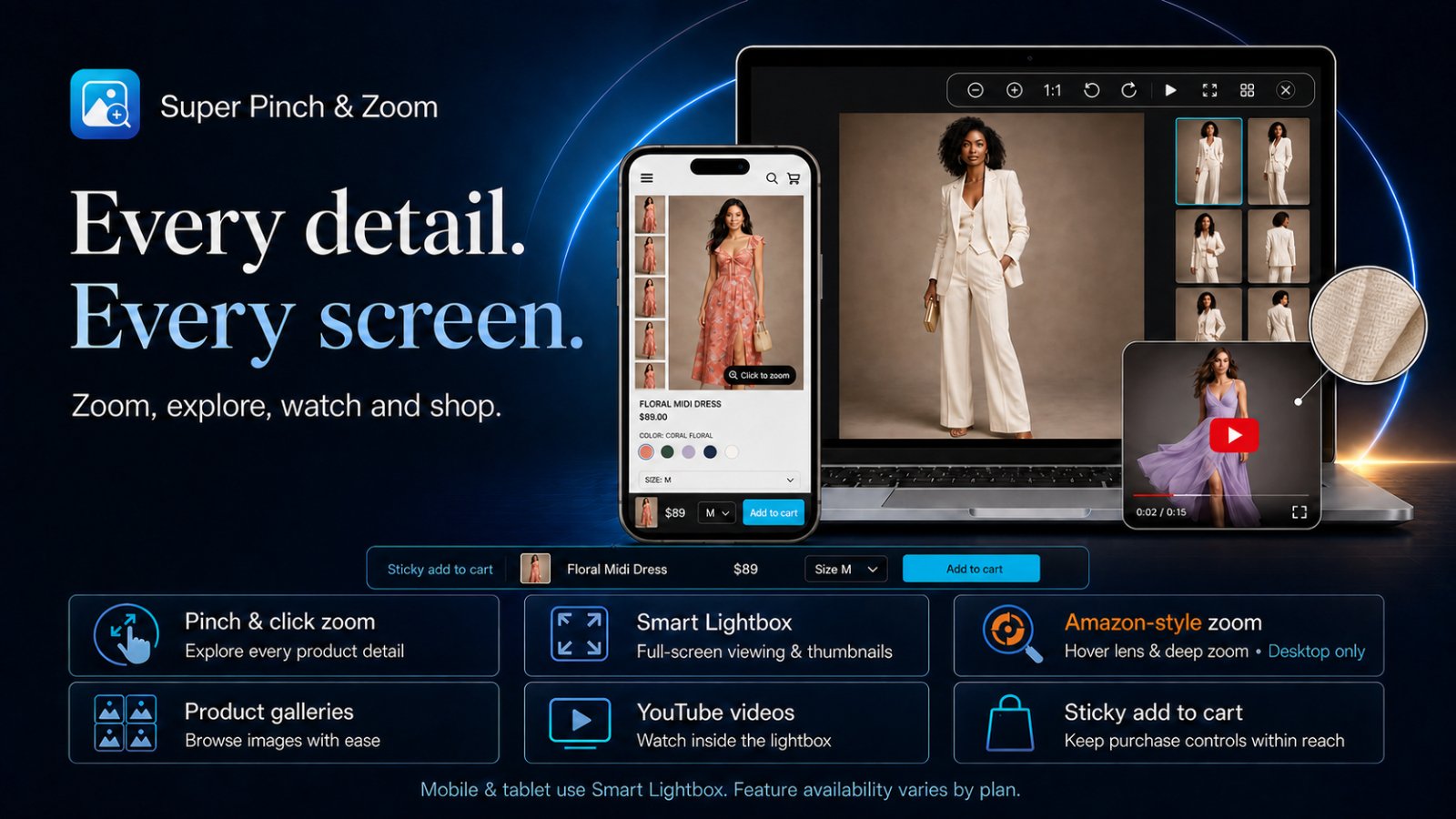
The responsive default for desktop, tablet and mobile. It supports gallery navigation, touch gestures and product video.
An optional desktop-only flow: hover lens → product popup → second-click deep zoom. Target all products, a Shopify tag or selected product IDs.
Phones and tablets automatically use Smart Lightbox so tap, swipe and pinch remain predictable on touch screens.
Amazon-style Progressive Zoom availability follows the feature permissions configured for each plan in the app admin. Do not hard-code plan names in theme code.
Amazon-style Progressive Zoom can be published selectively without changing the mobile experience. Open Zoom Setup → Optional Amazon-style Progressive Zoom, enable it, then choose an Apply to rule.
Use the desktop progressive journey across the full catalog. Best when product images and product-page markup are consistent.
Enter one exact Shopify product tag, such as progressive-zoom. Add that tag to every product that should use Amazon-style Progressive Zoom.
Enter the Shopify numeric product IDs shown in the product admin URLs. Use this for a controlled collection of individual products.
Targeted products use Amazon-style Progressive Zoom only on supported desktop pointers. Mobile, tablet and non-targeted products continue using Smart Lightbox.
The master switch controls which image tools shoppers can use inside supported viewers. Enable only the tools that improve inspection for your catalog.
Turn off the master switch to remove transformation tools together. Available controls follow the current plan and viewer type.
Use these settings to keep the lightbox consistent with the storefront design while preserving clear, touch-friendly controls.
Keep strong contrast between icons and their backgrounds. Always preview toolbar alignment on both desktop and mobile before publishing.
Sticky Cart keeps the purchase action visible after the main product form scrolls out of view and follows the currently selected product state.
The Sticky Cart should use the store's normal cart flow. Test products with unavailable variants, sale prices and multiple options before publishing.
Create a visual discovery page with Shopify-hosted images, responsive layouts, lightbox viewing and optional product tags.
Keep important subjects away from image edges so responsive cropping does not hide product details. Feature availability follows the current plan.
The automatic media detector supports modern Online Store 2.0 themes. Customized product galleries may need a manual product-media selector.
The slider reads each product’s own image metafields; Zoom and the gallery stay separate.
Basic comparison and Advanced styling have separate plan permissions. Advanced controls include shape, spacing, width, colors and starting position. Sync permissions after plan changes.