
Mobile Pinch Zoom for Shopify Product Images
Create a predictable touch-friendly product image experience on phones and tablets.
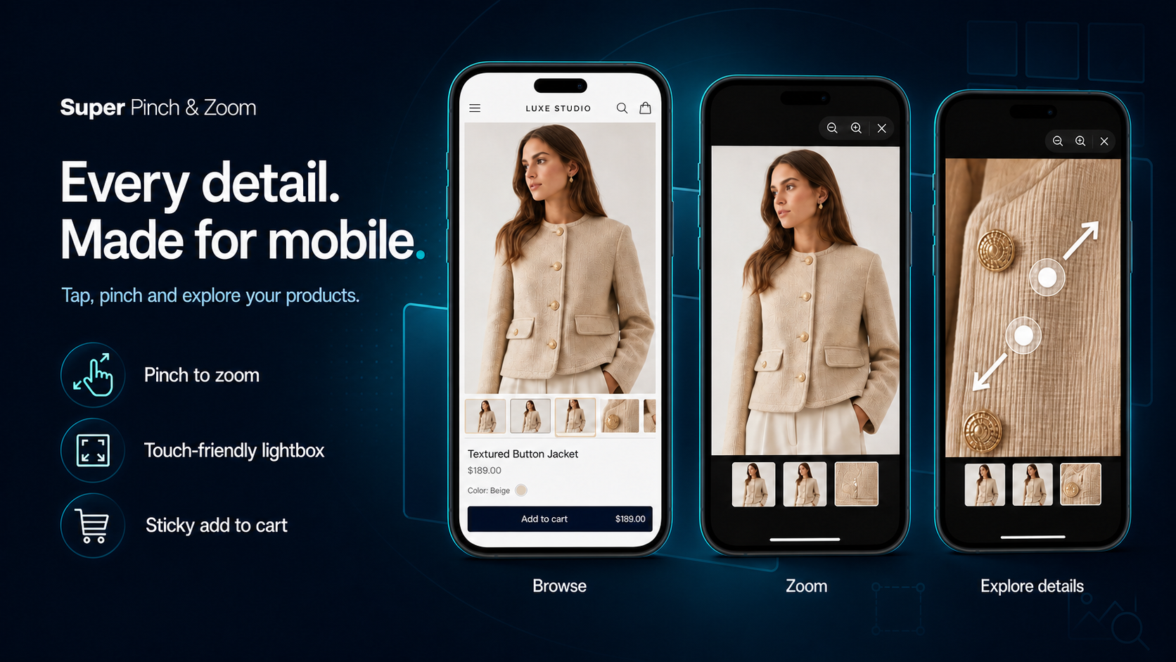
Mobile shoppers expect product images to behave naturally. When customers browse a Shopify store on a phone, they want to inspect details, compare variants, and view products from multiple angles without struggling with awkward controls. A responsive pinch-to-zoom experience helps shoppers make purchasing decisions with confidence.
Whether you sell clothing, jewelry, electronics, home decor, beauty products, or custom items, customers frequently rely on product images before making a purchase. The easier it is for shoppers to examine details, the more likely they are to trust what they are buying.
Why Mobile Image Zoom Matters for Shopify Stores
Mobile commerce continues to grow, and many Shopify stores receive most of their traffic from smartphones. Unlike desktop users, mobile visitors cannot hover over an image to inspect details. Instead, they expect familiar touch gestures such as tapping, pinching, swiping, and dragging.
A good Shopify image zoom experience helps shoppers:
- Inspect product texture, materials, and craftsmanship.
- View color variations more accurately.
- Understand product details before purchasing.
- Reduce uncertainty and hesitation.
- Build trust in product quality.
When shoppers can clearly see the details of a product, they are often more confident in their purchase decisions.
Start with a Responsive Mobile Viewer
A responsive product image viewer should adapt smoothly to different screen sizes and orientations. What works on a large phone may not work well on a compact device. Your viewer should fit the current viewport and keep important controls visible at all times.
Consider the following factors:
- The image should scale appropriately across devices.
- Close controls should remain visible and easy to tap.
- Images should remain understandable in portrait and landscape modes.
- The viewer should respect device safe areas and not hide controls behind notches or interface elements.
- Navigation should remain accessible even when images are zoomed.
Testing only in a desktop browser is not enough. Always check the experience on real mobile devices whenever possible.
Support Familiar Mobile Gestures
Customers already know how mobile image galleries should work. The best Shopify product galleries use familiar interactions that require little or no learning.
Common gestures should include:
- Tap to open the selected image.
- Pinch to zoom in or out.
- Drag to inspect magnified image areas.
- Swipe to move through product gallery images.
- Tap a close button to exit the viewer.
Consistency matters. Shoppers should never wonder which gesture they need to use. The interface should respond predictably and smoothly.
Avoid Trapping Page Scrolling
One of the most common mobile gallery mistakes is interfering with normal page scrolling. Visitors should be able to scroll naturally when the gallery is closed.
When the lightbox or zoom viewer is open, touch interactions should focus on image navigation. When the viewer is closed, the page should immediately return to normal scrolling behavior.
Poor gesture handling can create frustration and increase bounce rates. Customers should feel in control throughout the browsing experience.
Balance Image Quality and Performance
High-quality images are essential for an effective zoom experience. However, image quality should not come at the expense of page speed.
Large source files may provide excellent detail but can increase loading times. Slow-loading product pages may negatively affect user experience and reduce engagement.
For the best balance between clarity and speed:
- Use high-resolution Shopify-hosted product images.
- Compress images appropriately.
- Maintain consistent image dimensions.
- Avoid oversized files that provide little visual improvement.
- Optimize media for mobile devices.
The goal is to display product details clearly while delivering a fast shopping experience.
Use Consistent Product Photography
Even the best pinch-to-zoom technology cannot compensate for inconsistent product photography. Customers expect a professional presentation across all gallery images.
Consider following these best practices:
- Use consistent backgrounds.
- Maintain uniform product positioning.
- Keep lighting consistent.
- Use matching crop ratios.
- Include detail shots where appropriate.
Professional images make zoom functionality significantly more valuable because shoppers can clearly inspect the product.
Keep Product Information Accessible
Important product details should never exist only inside images.
While a zoom viewer helps shoppers inspect visual information, product descriptions, materials, dimensions, compatibility information, and care instructions should remain available as searchable page text.
This improves:
- User accessibility.
- Search engine understanding.
- Mobile usability.
- Customer confidence.
Keep Shopify Variants Synchronized
Variant synchronization is one of the most important aspects of a Shopify product gallery.
When a customer selects a color, style, size, or material variation, the gallery should immediately display the corresponding media.
Before publishing, test the following scenarios:
- Select a variant and open the viewer.
- Switch to another variant.
- Confirm the correct image appears.
- Reopen the gallery.
- Verify synchronization remains accurate.
Pay special attention to products where:
- Some variants share media.
- Certain variants use unique images.
- A variant lacks dedicated media.
Incorrect variant images can create confusion and harm customer trust.
Support Product Videos Alongside Images
Many Shopify stores now use product videos to demonstrate functionality, materials, and usage. A modern product media viewer should support images and videos within the same gallery experience.
Customers should be able to:
- Navigate between images and videos.
- Play product videos easily.
- Access controls without obstruction.
- Return to image viewing smoothly.
Combining video and image content creates a richer product presentation while helping visitors understand products more effectively.
Accessibility Considerations
An effective Shopify product gallery should be accessible to all visitors.
Accessibility improvements may include:
- Clearly labeled controls.
- Sufficient button sizes.
- Visible focus states.
- Keyboard navigation support where appropriate.
- Adequate color contrast.
Accessible design improves usability for everyone, not just users with specific accessibility needs.
Common Mobile Zoom Mistakes to Avoid
Many stores unintentionally create friction through poor gallery implementation.
Common mistakes include:
- Tiny close buttons.
- Low-resolution source images.
- Unresponsive gesture controls.
- Broken variant synchronization.
- Slow-loading galleries.
- Overly aggressive zoom levels.
- Missing product video support.
- Blocking normal page scroll behavior.
Avoiding these issues can substantially improve the overall shopping experience.
Mobile Test Checklist
Before launching any Shopify image zoom solution, complete a mobile testing process.
- Test on both iOS and Android devices.
- Use cellular connections as well as Wi-Fi.
- Review products with a single image.
- Review products with long image galleries.
- Play product videos.
- Verify controls remain reachable.
- Rotate the device during viewing.
- Check variant synchronization.
- Confirm accessibility labels.
- Verify page position is preserved when closing the viewer.
Conclusion
A great mobile pinch-to-zoom experience is simple, familiar, and reversible. Customers should be able to inspect product details, browse gallery media, watch videos, switch variants, and return to purchasing without losing their place.
For Shopify stores, a responsive mobile zoom solution can improve product exploration, customer confidence, and overall shopping experience. By combining high-quality product images, smooth pinch-to-zoom functionality, synchronized variant media, and mobile-friendly controls, merchants can create a product gallery that feels natural on every device.
Looking for a Shopify solution that supports mobile pinch zoom, responsive lightboxes, product videos, and variant-aware media? Super Pinch & Zoom helps merchants provide a professional product viewing experience without rebuilding their theme.